emergen-c refresh
01 / THE CHALLENGE
Refresh the Emergen-C logo while preserving its recognizable energy
and softening its bold, flat visual presence.
02 / THE STRATEGY
Evolve rather than reinvent—maintaining established brand equity
while introducing greater dimension, warmth, and approachability.
03 / THE IDENTITY
Refined typography, subtle gradients, and strategic shading gave
the mark greater depth while retaining its distinctive personality.
04 / THE BALANCE
The evolved identity brought together two essential qualities: the
energy associated with Emergen-C and a softer, more contemporary expression.
05 / THE EVOLUTION
A refreshed logo that feels familiar yet revitalized, providing
a stronger foundation for the brand’s visual expression.
FAMILIAR ENERGY / REFINED DIMENSION / EVOLVED IDENTITY


original


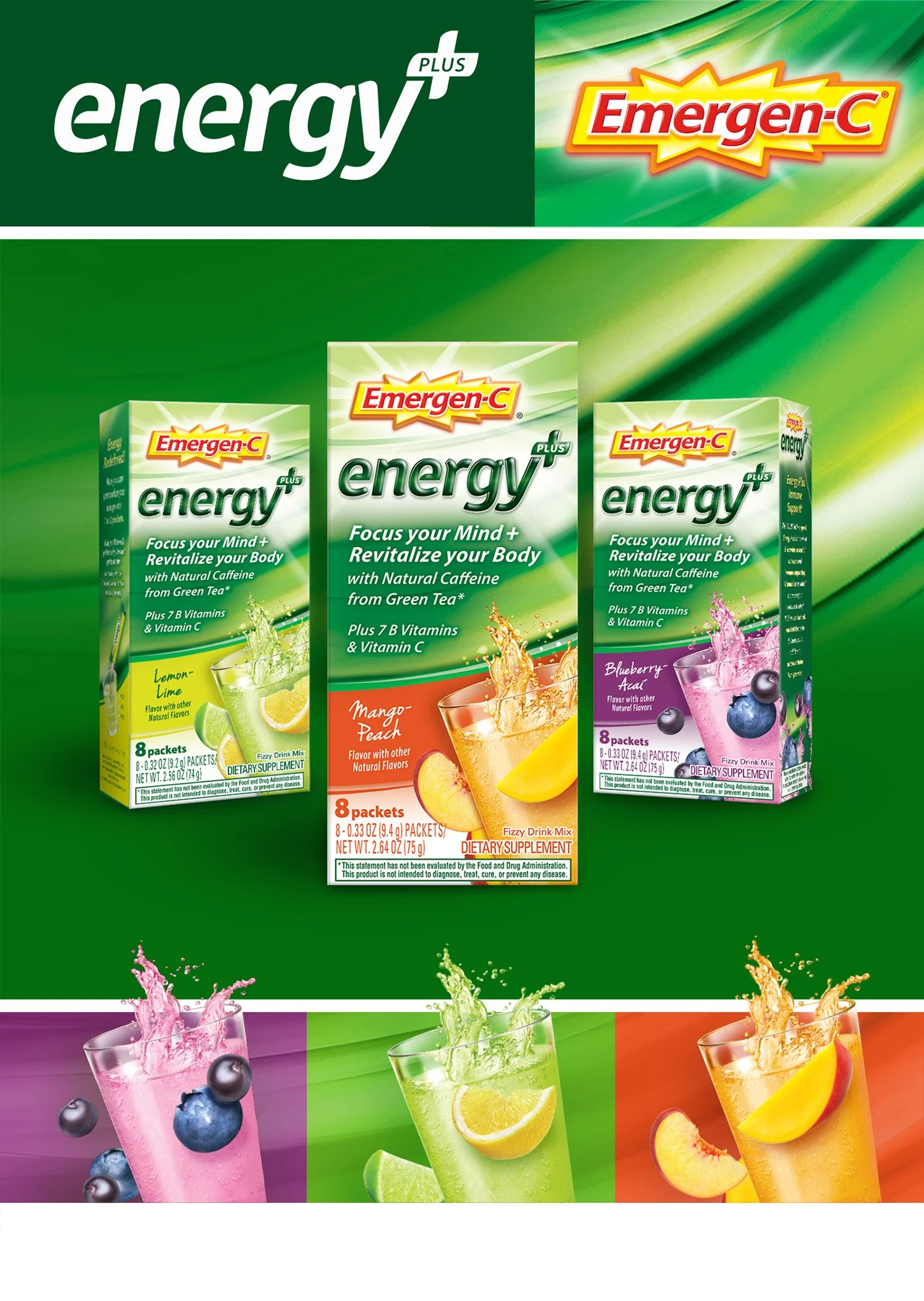
emergen-c energy
LAUNCHING ENERGY WITH A MORE BALANCED PERSPECTIVE.
01 / THE CHALLENGE
Introduce a new energy-focused product while expanding Emergen-C beyond
traditional energy cues into a broader wellness space.
02 / THE STRATEGY
Position energy as part of overall well-being—balancing revitalization and vitality
with a more holistic, approachable expression.
03 / THE DESIGN
A fresh visual language combined energetic cues with a sense of balance, creating
a distinctive look while remaining connected to the Emergen-C brand.
04 / THE PACKAGING
The packaging translated the product promise into a clear shelf presence,
communicating both energy and wellness within a unified design system.
05 / THE LAUNCH
Emergen-C Energy extended the brand into new territory with a product
and identity designed around feeling energized, balanced, and renewed.
ENERGY / WELLNESS / BALANCE / ONE NEW EXPERIENCE.