strong earth branding & packaging
A BOLD IDENTITY BUILT TO DISRUPT THE CATEGORY.
01 / THE CHALLENGE
Enter the competitive supplement category with a brand that could break through
established conventions and command attention.
02 / THE STRATEGY
Build Strong Earth around a distinctive visual language that communicated energy,
confidence, and a fresh perspective on everyday wellness.
03 / THE IDENTITY
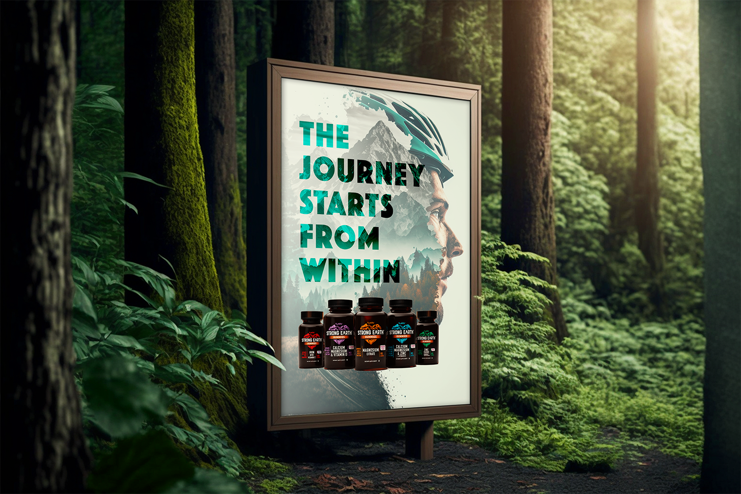
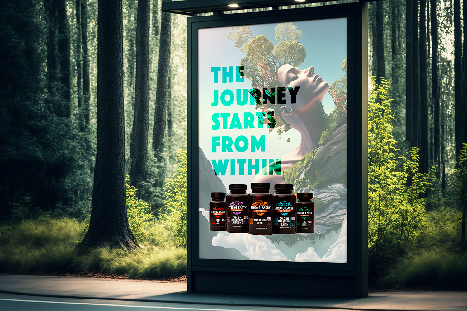
A bold graphic system, expressive typography, and vibrant color palette created an
ownable brand world with immediate recognition.
04 / THE PACKAGING
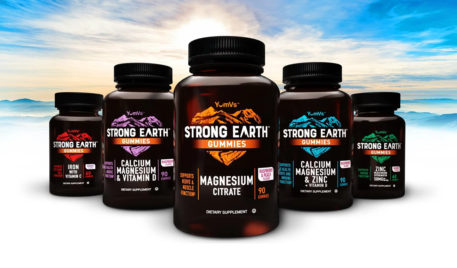
The identity translated into a packaging system designed for strong shelf presence
while clearly organizing products, benefits, and variants.
05 / BUILT TO STAND OUT
Strong Earth launched with a flexible visual platform that differentiated the brand
while providing a foundation for future growth.
BOLD IDENTITY / DISTINCTIVE PACKAGING / BUILT TO DISRUPT.